Vintage & Neck Tags, Back & Other Labels
By Siobhan Turner
Many wines, in particular Burgundies from small producers, do not have the vintage printed actually on the label, but will indicate it via a vintage label on the neck of the bottle.
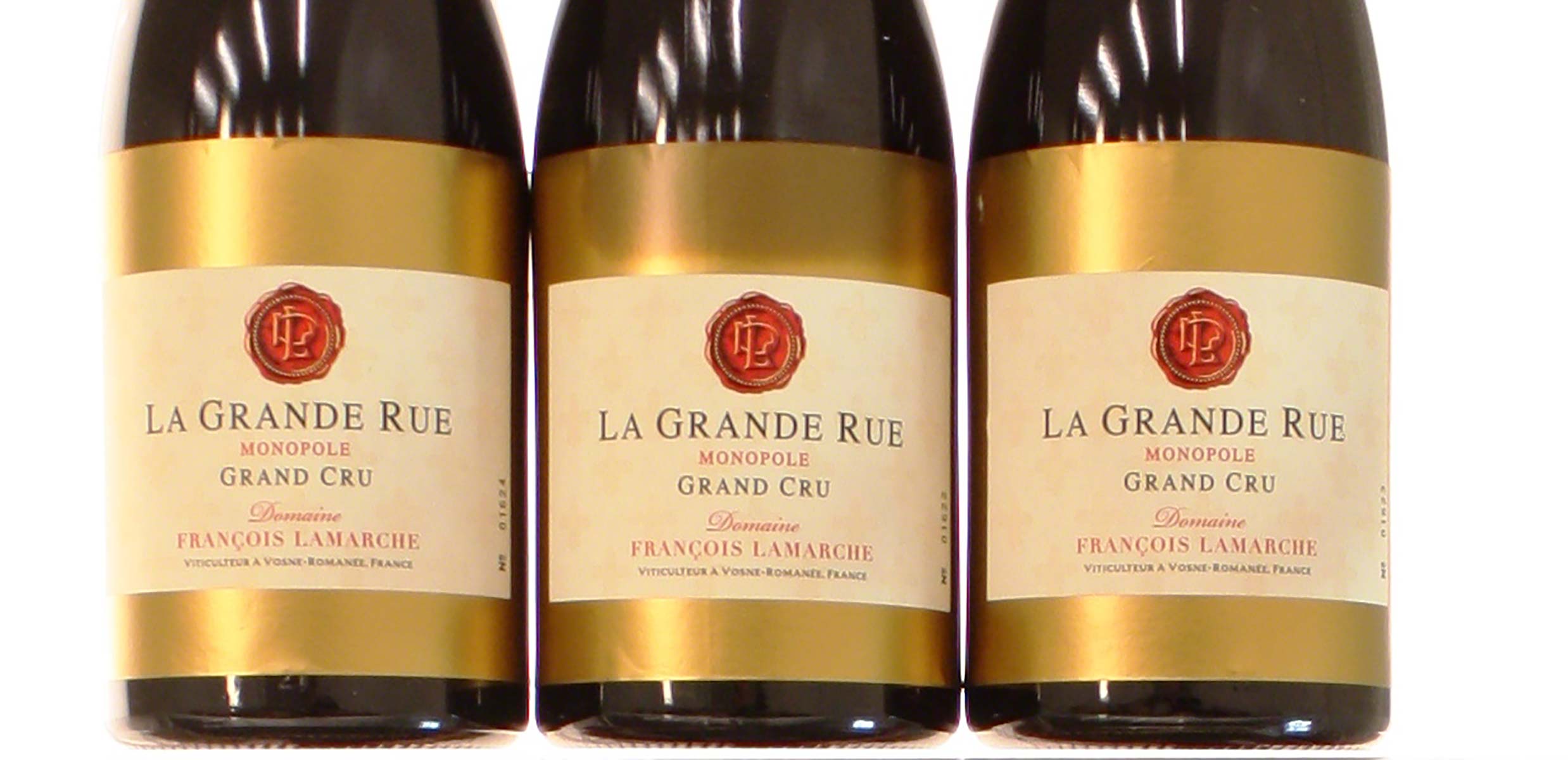
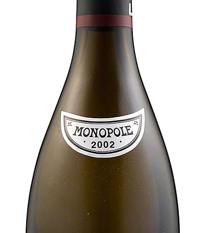
Neck labels may also be used to, for example, indicate that a particular wine is from a vineyard owned by a single producer – such as the “monopole” tag on bottles of Domaine de la Romanée-Conti’s La Tâche and Romanée-Conti.
History
Most of the detail of the history of wine labels is covered under the “labels” section. Below is a summary of the key points
In 1611 a group of Scots including Thomas Percival received the first patent for a coal-fired glass furnace, which dramatically changed the heat at which glass could be fired and, therefore, its strength. For the first time, it could reliably withstand transport, and wine could be shipped in bottles. Thus, for the first time, labels were necessary to indicate a bottle’s contents. Wine bottle labels are first known to have originated with the Benedictine monk Pierre Pérignon (he of Dom Pérignon fame) in the early 1700s, who would hand-write labels on parchment and tie them around the neck of the bottles with string. Nevertheless, most wine was still sold in barrel, and identifying the barrel was the most important factor for purchasers.
As bottles became more reliable and thus more frequently used, labels became more important. Lithography, invented in 1798, enabled the mass production of wine labels, and permitted colour printing, and much greater detail. It was at this time that labels as we would now recognise them came to be printed. Nevertheless, it is important to remember that most labels before the mid-50s were merchant labels. Indeed, it was illegal in England to sell wine in bottles until 1860.
The treatment of paper also changed. In the mid-50s, paper quality became much better, and labels started to be made from bleached paper. Recycled paper came into use, but these lower grade papers are not used by the great producers.
Expectations
Above all, a neck label must be consistent: with the condition implied by its purported age, with the condition of the rest of the bottle, with known manufacturing standards of the time, and with the size of the bottle.
Paper should be of a standard expected of the wine and its time. Look in particular for the “Concord” watermark, a hallmark of Rudy Kurniawan’s labels.
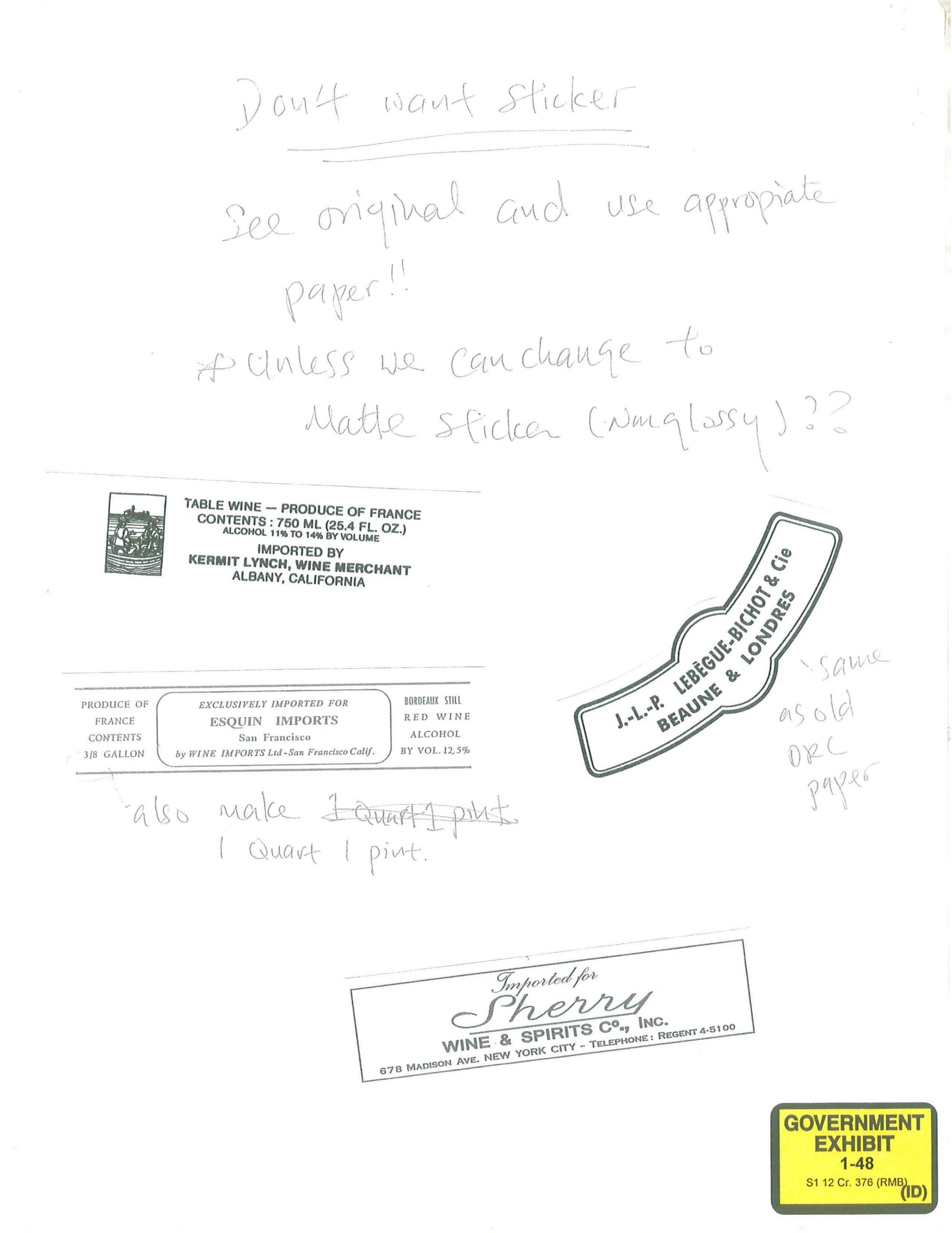
Neck labels pre-1957 would not have been bleached, so should not fluoresce under blue light. In addition, producers did not use self-adhesive labels before the late 80s. For example, Domaine Ponsot only began using self-adhesive labels in 1989; any labels before this would have been applied with glue.
Printing should be clear, consistent, and detailed.
If a bottle is showing signs of age, these should be consistent with expectations. (See aging.)
Monopole should only be applied to appropriate vineyards.
What to look for
The first thing to look for on the label is inconsistency. Typical inconsistency that can indicate fraud includes:
- Vintage label being considerably more or less worn or aged looking than the capsule and cork;
- Main label showing different levels of age to vintage label (if present) or back label;
- Stains (or lack of) that are not consistent with the condition of the capsule; or
- Quality of paper or printing inconsistent with purported quality of the bottle.
Any significant inconsistencies should raise alarm bells.
It is also essential to look at clarity and quality of the printing. Forgers in some cases have managed to create a good-looking template to use, but because they will be working from a later generation imprint, it will lack the detail and clarity of the true label. (This is a hallmark of the Hardy Rodenstock bottles, for example.) This is particularly true, for example, in some of the very detailed areas. Look at the corners, at the small details that are not typically obvious. Is the lettering clear and defined? It should also be consistent (there’s that word again) with the time and expectations; first growth Bordeaux chateaux and grands crus Burgundies do not use ink jet printers. If you have a magnifying glass or, better, a jeweller’s loupe, look at the printing carefully.
Thirdly, it’s important to examine quality of the ink itself used, especially if it is metallic. It should show clear evidence of metal when closely examined – rather than simply a bronze or gold or silver colour, it should shine. Lettering should be well-defined, and even – dropped or overly slanted letters suggest it has not been properly printed.
Fourthly, if the label does have some age or damage on it, use your senses. If it’s showing signs of aging, it should smell like old paper. If it smells like tea, coffee, or as if it’s been cooked, that is a sign of potential false aging, and should raise alarm bells. One of the things that Rudy Kurniawan would do is bake labels in the oven, to simulate the colour changes that come with gradual oxidation. He was also known to use tea to artificially age the look of a label.
Anti-counterfeit measures and technology
There are a number of anti-counterfeit measures that producers use to guard against fraud. The detail on labels is an obvious measure – the more intricate detail, the harder it is to convincingly fake. Embossed printing, metallic ink and textured paper also all provide some safeguards.
For pictures of Rudy Kurniawan label templates, click here.